
An identity and website, built for a 25-year architecture practice
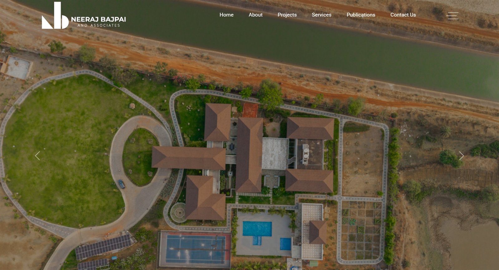
Twenty-five years of built work, and nowhere to send a client.
Neeraj Bajpai & Associates works across architecture, interior and landscape design in Raipur. Twenty-five years of completed projects existed only in the office, there was no site to send a prospective client to, and no mark to put on a drawing or a card.
I was working there as an interior designer at the time and took on the identity and the website alongside that. I designed the logo, the site map and every screen; a developer built it from my Figma files.
A minimal, greyscale mark, in four weeks.
The principal’s brief was short: straight lines, no ornament, nothing that needs explaining. Four weeks was the only hard constraint, and it pushed every decision toward a system that could be built quickly and stay consistent as new projects were added.
Having worked in the studio, I already knew the projects, the typologies and the principal’s taste before anything was drawn, the brief wasn’t a guess at a stranger’s business, it was designing for work I’d seen built.
Somewhere to send a client.
A site that could carry the built work, organised well enough that a prospective client could find their kind of project.
A mark that needs no explaining.
Greyscale, straight lines, no ornament, legible at signage scale and at favicon scale alike.
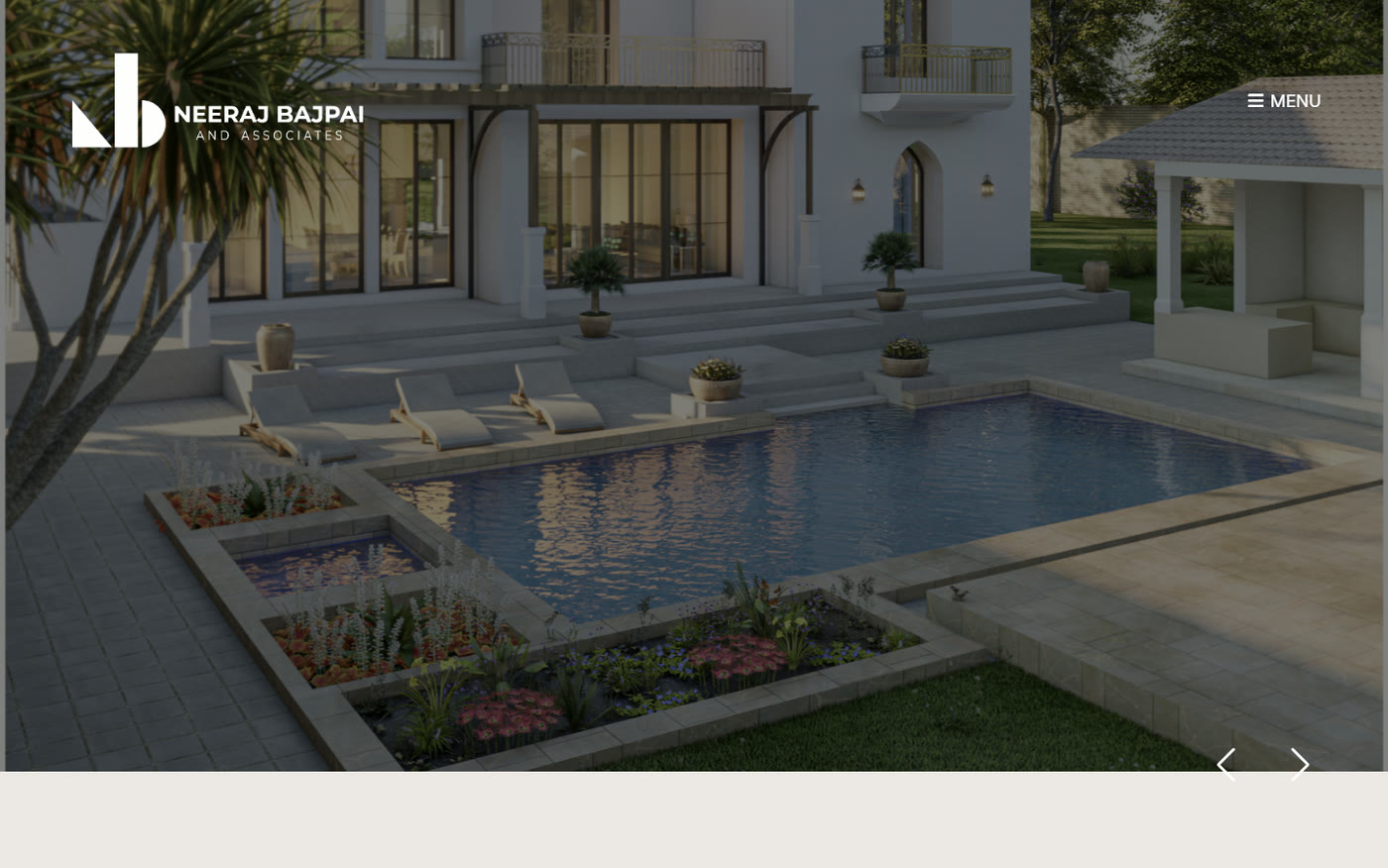
Photography does the talking.
Twenty-five years of built work is the argument. The site had to get out of its way.
The mark isn’t a drawn NB, it’s the instruments that draw.
A set square, a protractor and a scale rule, arranged until they read as the initials. The wedge of a set square makes the N; the half-round of a protractor and the flat bar of a rule make the B. Three solid shapes, no fine detail, so nothing is lost at small sizes.

Drafting instruments settled the geometry.
The set square, protractor and rule aren’t decoration, they fixed the proportions of the mark before a line was drawn.
Greyscale by instruction.
No colour, so the mark never competes with the photography it almost always sits on.
Reversed is the default, not the exception.
It sits on full-bleed imagery far more often than on flat ground, so white-on-photo was designed first.
Established Mumbai practices set the reference point.
I looked at how established architecture studios present decades of work online. The pattern was consistent: photography carries the page, navigation stays quiet, everything gets room to breathe. For a 25-year practice with no site at all, the target was never invention, it was a site that looked like it had always been there.
Took
Polish, clean lines, generous spacing, layouts that don’t argue with the work inside them.
Kept quiet
Muted chrome, so project photography is the loudest thing on any page.
Avoided
Anything decorative or effect-led, it dates fast, and fights a greyscale mark.
Projects split by building type, not by date.
A prospective client thinks in terms of what they’re building, not when the practice built it, so Projects branches into Residential, Commercial, Farmhouse and Upcoming. A second visitor, someone researching the studio itself, not a specific project, is served by About, Services and Publications running alongside it.
- About
- Projects
- Residential
- Commercial
- Farmhouse
- Upcoming
- Services
- Publications / News
- Contact
Sitemap, as built.
Designed in Figma, built by a developer.
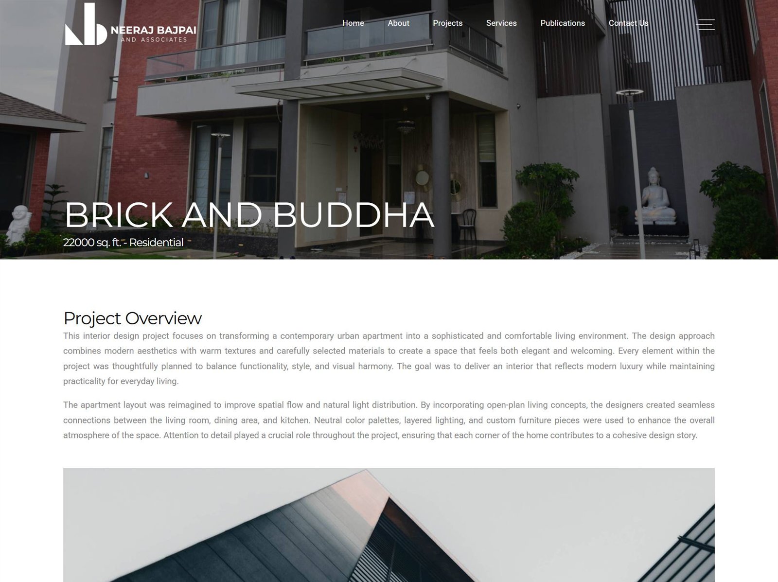
Every screen below is the live build, the layout system, the type and the reversed mark carried through from the Figma files. A developer built it, and some details shifted in the handoff; the originals are no longer with me, so what’s shown here is the site as it runs today.
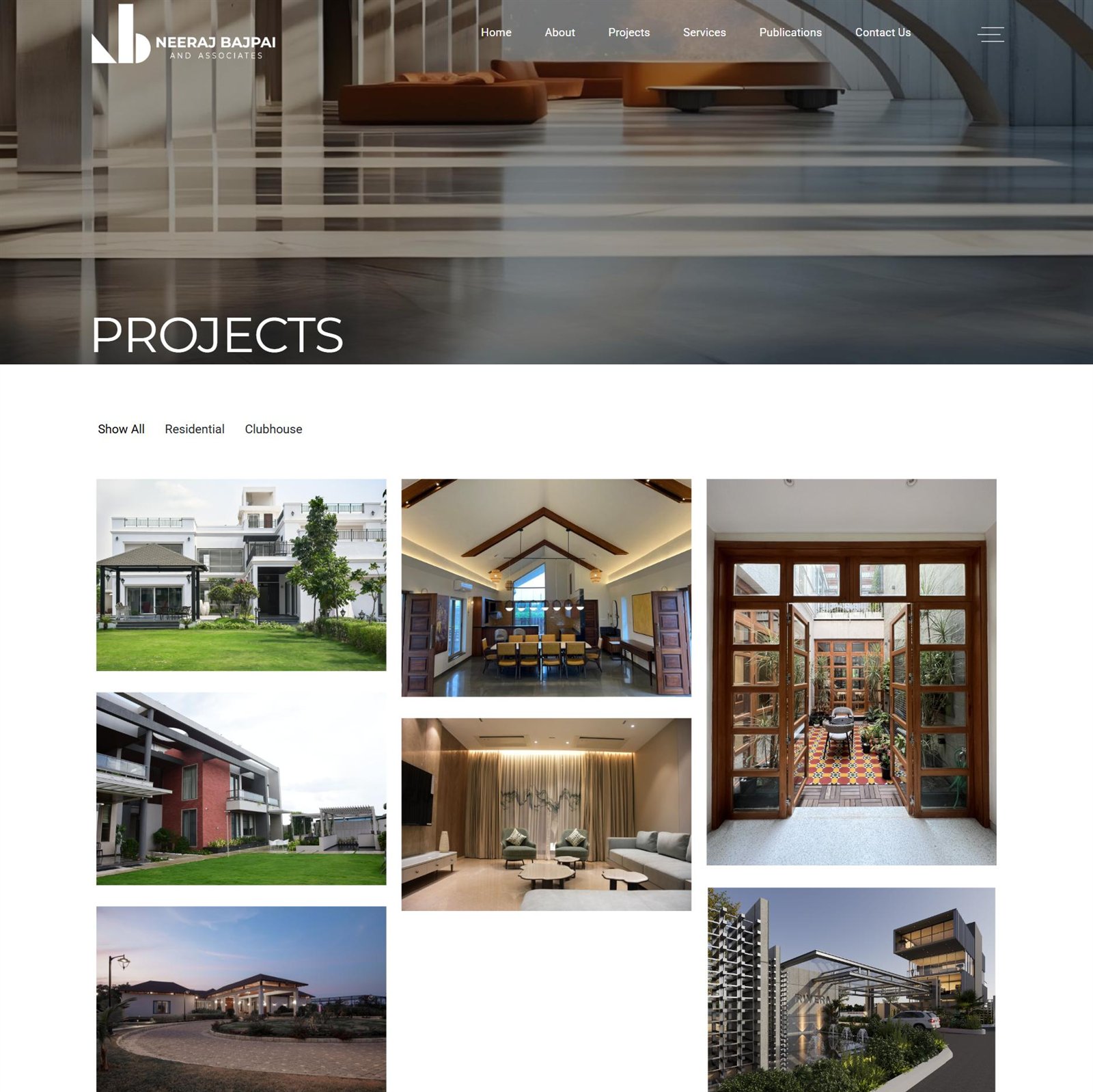
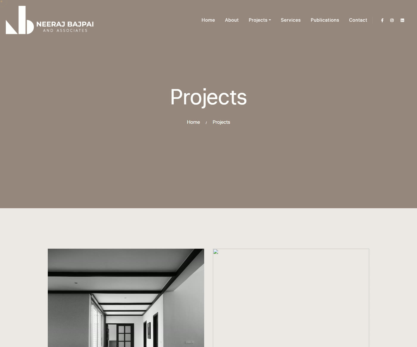
A muted band carries title and breadcrumb.
Everything below it sits on plain bone, so the photography stays the only loud thing on the page.
One geometric sans, two jobs.
Light at display sizes for titles, letterspaced caps for labels, no second typeface to manage.
The nav collapses to the mark.
On a phone, the header reduces to the monogram and a toggle, and the grid drops to one column.
Live, in use, and still the studio’s site.
Live
Running at neerajbajpaiassociates.com.
Logo in use
The NB mark is the studio’s mark now, on the site and beyond it.
Somewhere to send a client
The one thing the practice didn’t have before this.
What I learned
Knowing the work from inside changes what you design.
I wasn’t guessing at a client’s taste from a brief call. I’d seen the projects and the principal’s eye for months, so the greyscale, straight-lines direction wasn’t a pitch, it was already the answer by the time I opened Figma.
Restraint is a decision, not an absence of one.
A quiet mark and a muted layout look like the easy choice. Keeping every colour, every ornament and every clever layout idea out of the photography’s way was the actual work, and it’s the part that’s easiest to undo by accident later.