
A handmade gifting brand’s first real online store
A gifting business that ran on chat.
Tofha makes handmade gifts: flower bouquets, hampers, engraved glass, letters, calligraphy and bookmarks. I started it and I run it. Before the store, every order began on Instagram and usually ended on WhatsApp, one conversation at a time.
The website had to let people browse, choose and pay on their own, while leaving room for the custom pieces that only ever start with a conversation. I designed it and built it.
Research
Old chats, sales history and conversations with past buyers.
Web design
How the catalog is organised, and every page of the store.
Development
Built on Shopify Hydrogen, with no theme underneath.
Every order began by answering the same questions.
Someone would see a bouquet in a post and message to ask the price. Then how long delivery would take. Then whether it could be personalised. None of it was hard to answer, but it had to be answered again for every buyer, before they had even decided to buy.
A typical order before the store: the same few questions, in a new chat every time.
Before designing a page, I went back through the chats.
Running Tofha meant the evidence was already sitting in the inbox. I read back through our Instagram and WhatsApp conversations, looked at which products and occasions sold, and asked past buyers how they had chosen.
Most people already knew what they wanted.
They had seen a specific piece and wanted its price and a delivery date, not suggestions.
The questions repeated.
Price, delivery time and personalisation came up in chat after chat. A page could answer them once.
Not every visitor would come from Instagram.
A website gets shared on WhatsApp, found on Google and passed on by word of mouth. Those people hadn’t seen the post, and many would only know the occasion or the person.
Three ways into the same catalog, on one page.
Collection is the default, because that is how most buyers already think: they came for flowers, or a bookmark. Occasion and Recipient sit right beside it for someone who arrives knowing only “it’s her birthday.” Switching swaps the filter row and the grid in place, so nobody has to back out to a menu to change their mind.
Each switch brings up its own row of filters over the same product grid.
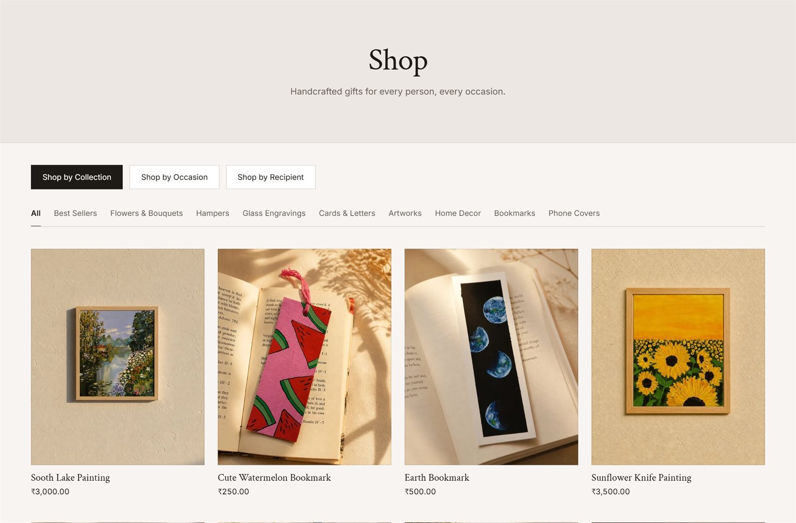
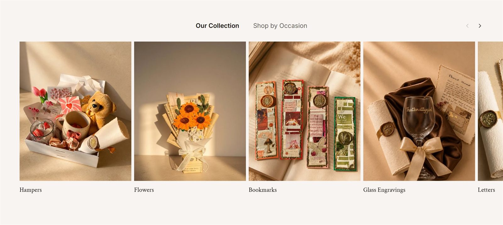
The homepage asks the same question first.
Right below the hero, the homepage splits into Our Collection and Shop by Occasion, so the choice starts before anyone reaches the shop.
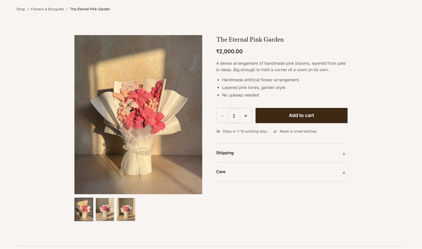
Answering the chat questions before anyone asks them.
Price, what the piece is, how long it takes to ship and the small-batch note all sit together above the fold, next to Add to cart. Shipping and care details fold into two rows underneath for anyone who wants more.
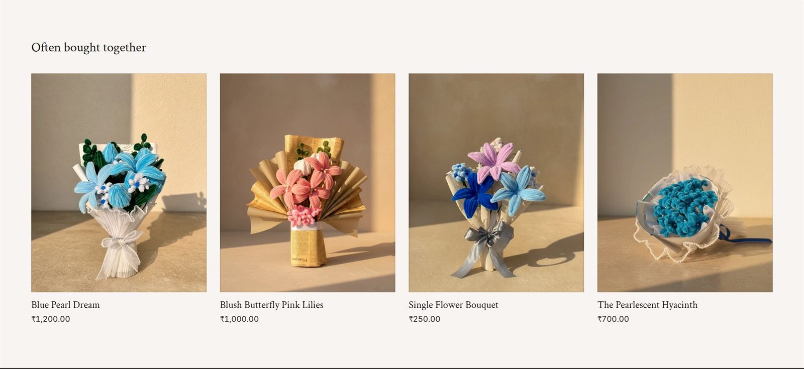
Giving “this goes well with it” a place on the page.
In a chat, it was easy to suggest a second piece that went with the first. A product page has no one to make that suggestion, so Often Bought Together sits under every product to do it instead.
Custom work still starts with a conversation, just a clearer one.
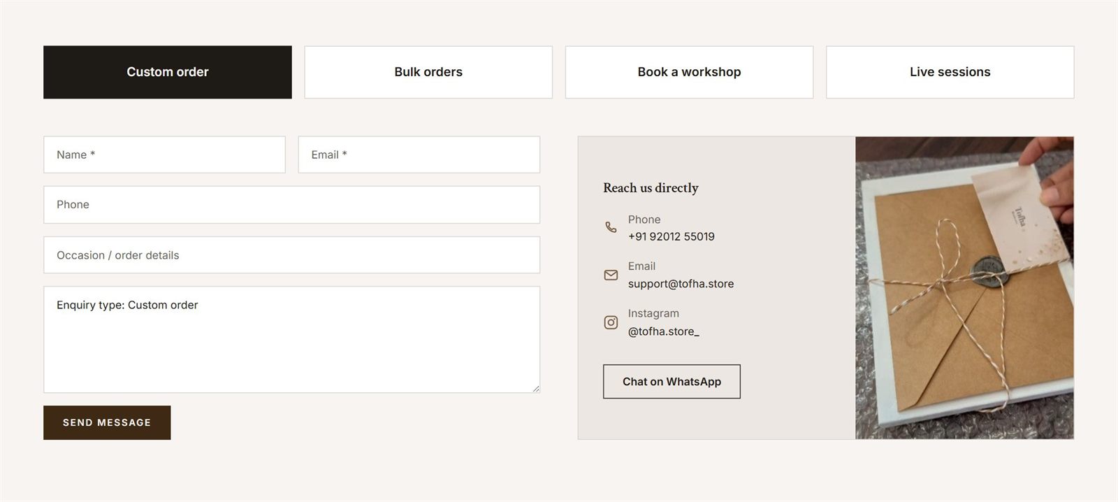
Not everything Tofha makes is in the catalog. Custom pieces, bulk orders, workshop bookings and live sessions all start on the contact page, where one form changes with the type of enquiry. Phone, email, Instagram and WhatsApp sit next to it for anyone who would rather just message.
The homepage ends on a short custom-request form too, so nobody has to go looking for the contact page to ask for something made just for them.
Selling a workshop to someone who has never been to one.
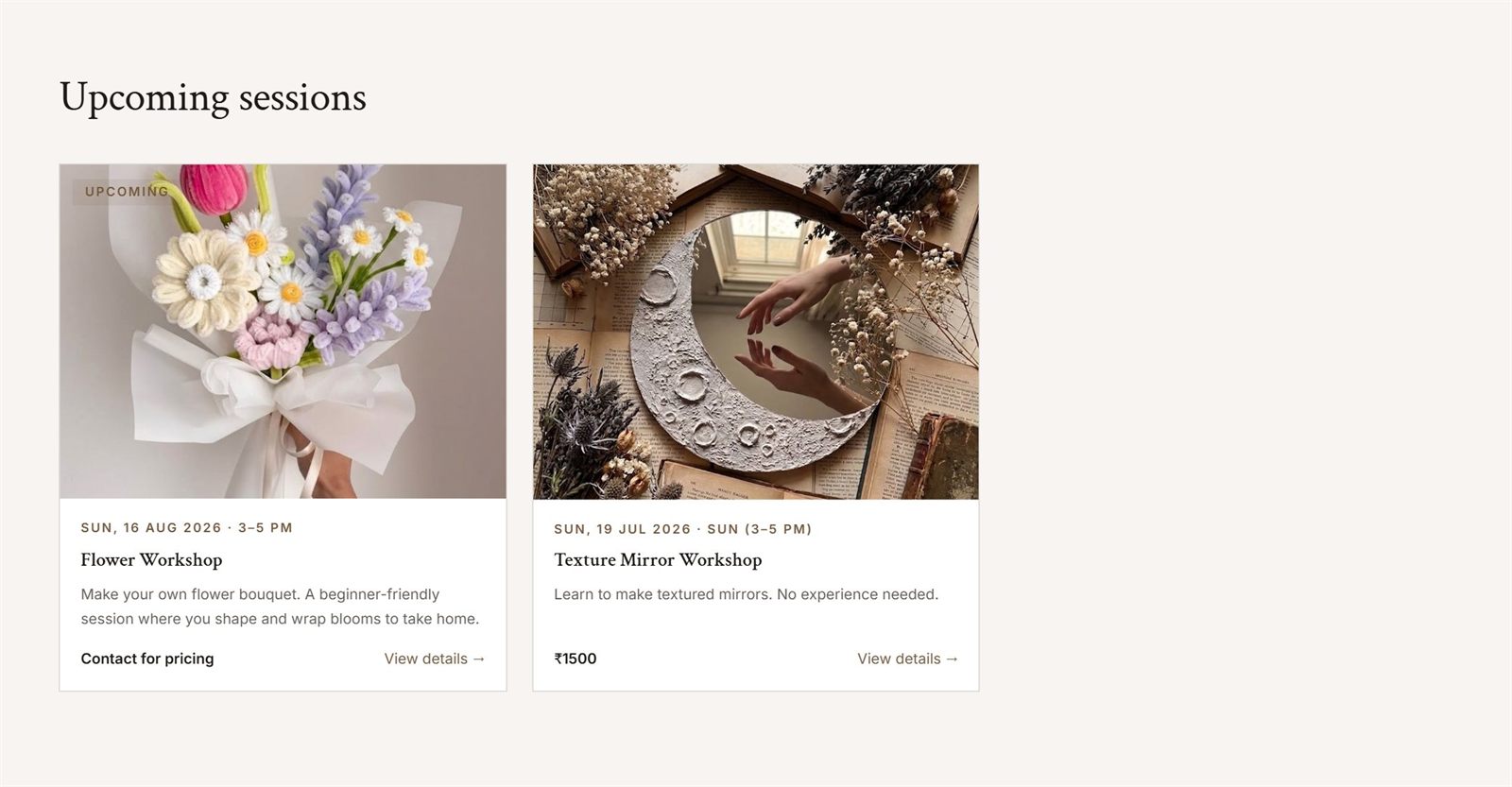
Tofha runs craft workshops once a month, so the site sells those too. Upcoming sessions lead the page, each with a real date, time, price and one line on what you will make.
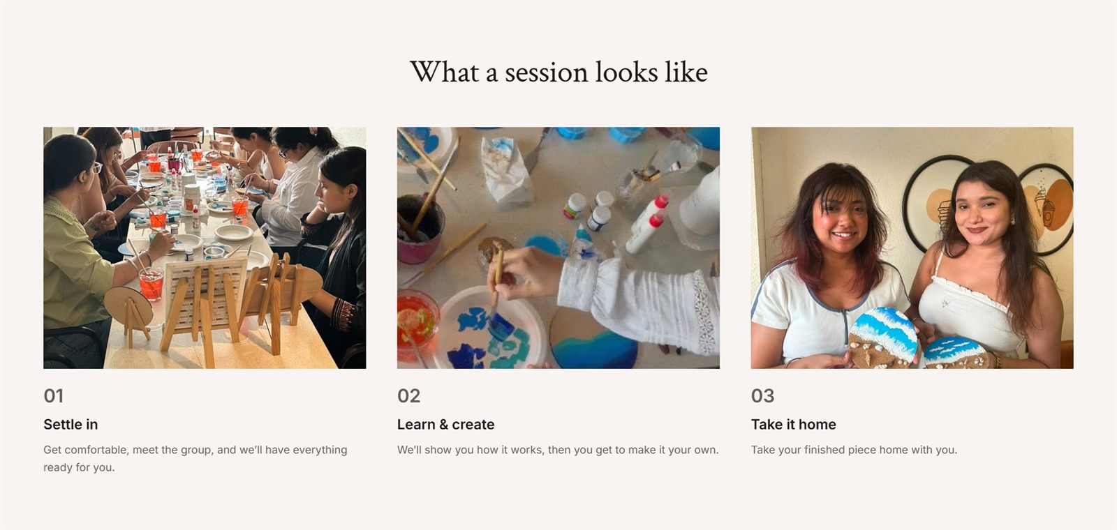
Below them, three steps (settle in, learn and create, take it home) answer what a first-timer actually wonders about, with photos from past sessions to show it.
Key pages in Figma, the rest designed in code.
The key pages started in Figma. The rest I designed directly in Shopify Hydrogen as I built them, which meant every layout had to work with real product photos from the first try. Building on Hydrogen instead of a theme meant the store could look like Tofha, not like a template.
Links to the store get shared in Instagram bios and WhatsApp chats, and those open on a phone, so every layout had to hold up at phone width.
What people come to the store to do, one thumb at a time.
Finding a gift
- (01)
Home
Scroll to Our Collection and tap Hampers.
- (02)
Shop
The shop opens already on Hampers. Tap one.
- (03)
Product page
Photos and price first, then Add to cart, with Often Bought Together below.
Asking for something custom
- (01)
Contact
Custom order is picked to start with.
- (02)
Bulk orders
Tap it and the form asks how many.
- (03)
Book a workshop
Now it asks what the event is for and when. The message's first line follows along.
Booking a workshop
- (01)
Workshops
Scroll to the upcoming sessions and tap one.
- (02)
The session
What you'll make, then the date, time and place, before any form.
- (03)
Reserve your spot
A short request at the bottom, with nothing to pay yet.
Live, selling, and still changing.
1,000+ orders to date
Across Instagram, WhatsApp and the store since Tofha began, and the store now takes orders without a chat.
Fewer repeat questions
“What’s the price?” and “how long will it take?” come in less often, though not by a lot yet.
Add-ons, some of the time
Some buyers now add a second piece from the suggestions under a product.
The store is still a work in progress. New products, sections and fixes go in as real orders show what needs to change.
An identity the store could carry.
The wordmark sets tofha in a lowercase serif, with तोहफ़ा and تحفہ beneath it, so the word appears in three scripts. A brown and taupe palette over two pale papers runs through the packaging, the cards and the storefront itself.
Every piece shot in the same light.
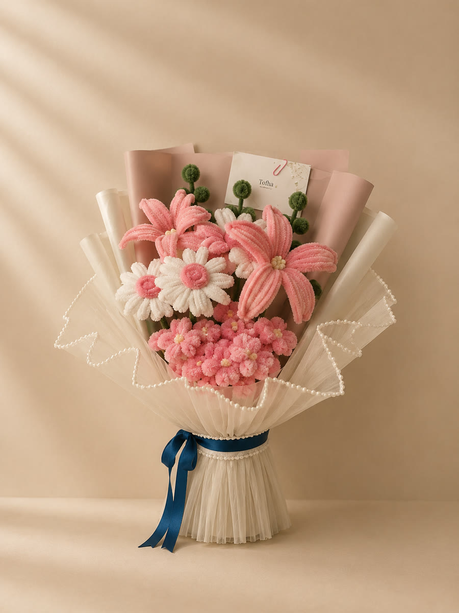
Warm, low light, soft shadows and a plain beige ground, with props kept to almost nothing. Shooting bouquets, hampers and bookmarks the same way is what lets the shop grid read as one collection rather than a mix of uploads.
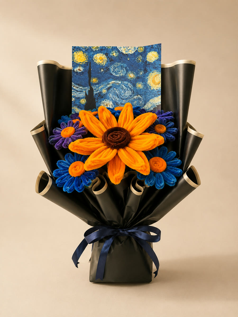
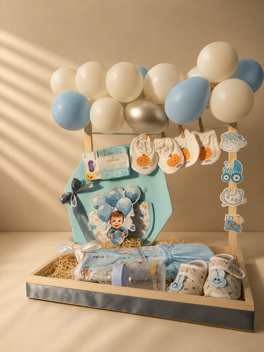
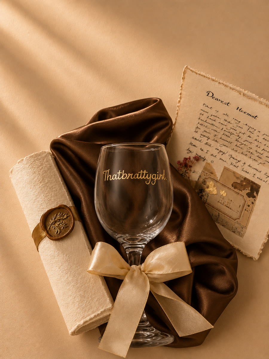
What arrives in the box.
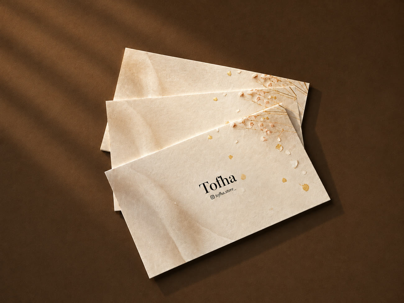
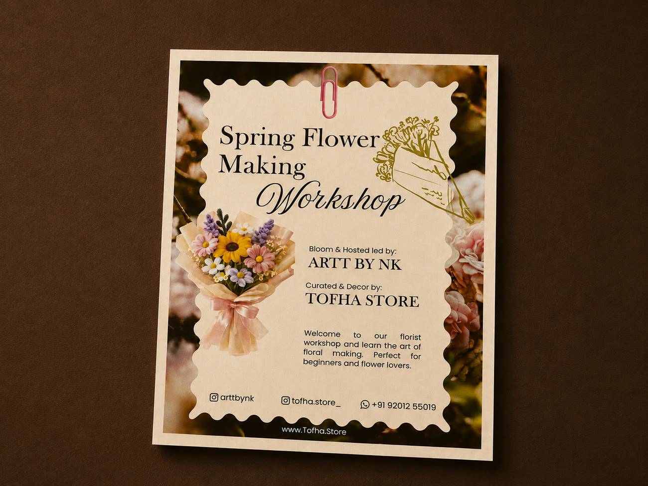
The business card is printed on handmade paper with gold leaf and pressed gypsophila set into the sheet, so no two are the same. The workshop card is louder: a scalloped die-cut window over a floral photograph, billed to Tofha and Artt by NK.
What I learned
The filters mattered most to the people I knew least.
I organised the shop around the buyers I knew from chat, who go straight to a product. Occasion and Recipient turned out to do their real work for first-time visitors, the group I had almost designed out.
Next time, I’d test with people who have never bought from Tofha.
All of my research came from people who already knew the brand: past buyers and old chats. Watching a few strangers use the site before launch would have shown me sooner who it really had to work for.