
Identity and web design for RAAH, a communication and marketing agency
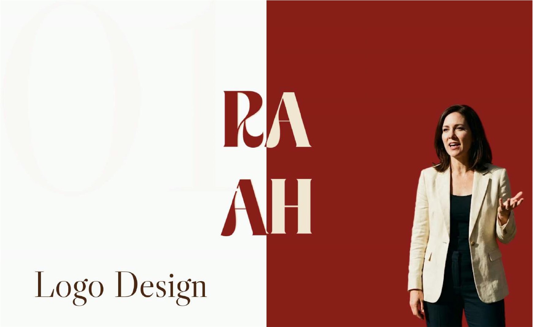
A new agency with two kinds of client, and no identity yet.
RAAH combines personalised communication training with creative marketing. It helps professionals and students speak with more confidence, and helps businesses look and market better. When I started, it had a name and nothing else.
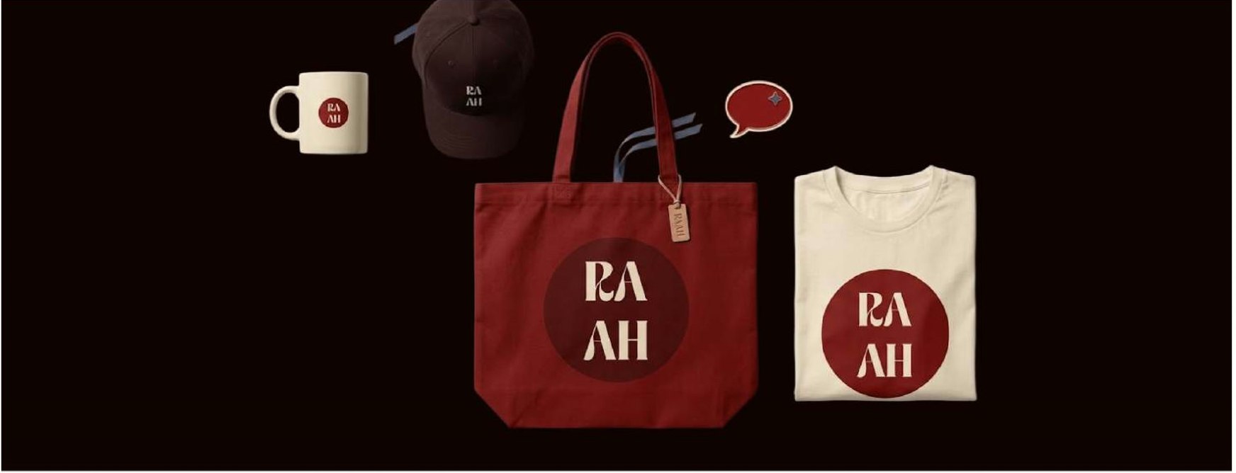
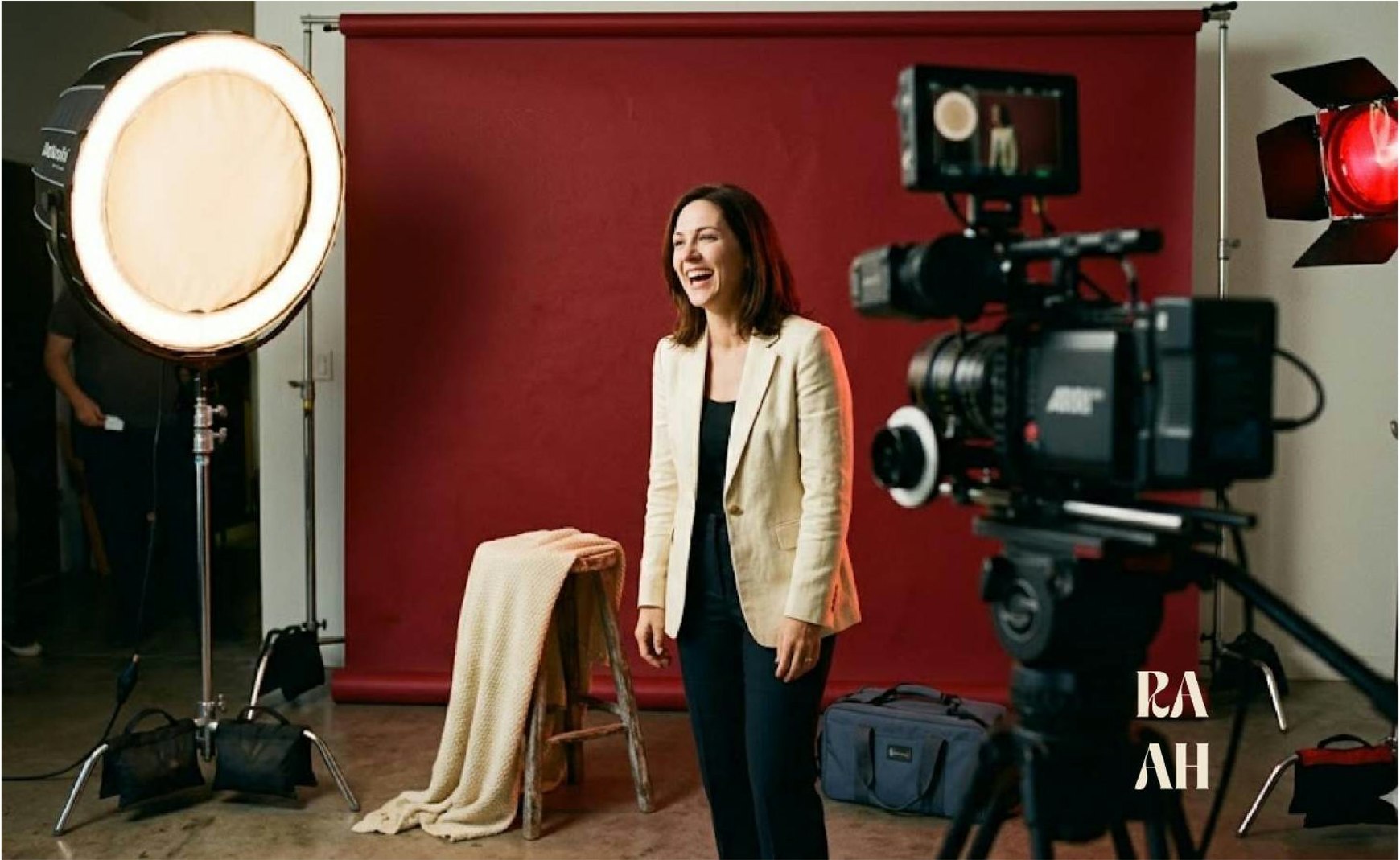
I designed the logo, the brand system around it (colour, type, pattern, photography direction, stationery and merchandise) and the website. I worked on it alone, over about two weeks.
Logo
A wordmark and a stacked version.
Brand system
Colour, type, pattern, photography, stationery and merch.
Website
The homepage and site design, under NDA.
One wordmark for businesses and for real people.
The client wanted a catchy wordmark that worked for both sides of the agency: polished enough for the companies that hire it for marketing, and warm enough for the students and professionals who come for coaching. They also needed a website to launch with.
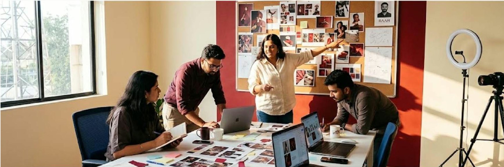
A clear process, even for an informal client.
RAAH is a real business run by someone I know, and this wasn’t a formal contract. So I set out the stages at the start, and we went through them one by one.
Four bold letters that read as one voice.
I tried other directions first, then landed on a short, heavy serif wordmark. Each part of it does a job.
A serif for the business side.
The high-contrast editorial serif gives it polish and credibility with companies.
Joined letters for the people.
The R flows into the A and the A into the H, like people in conversation.
Short and bold, so it’s catchy.
Four heavy letters are easy to remember and easy to say.
A stacked version for small spaces.
RA over AH makes a compact badge for social media, business cards and merchandise.
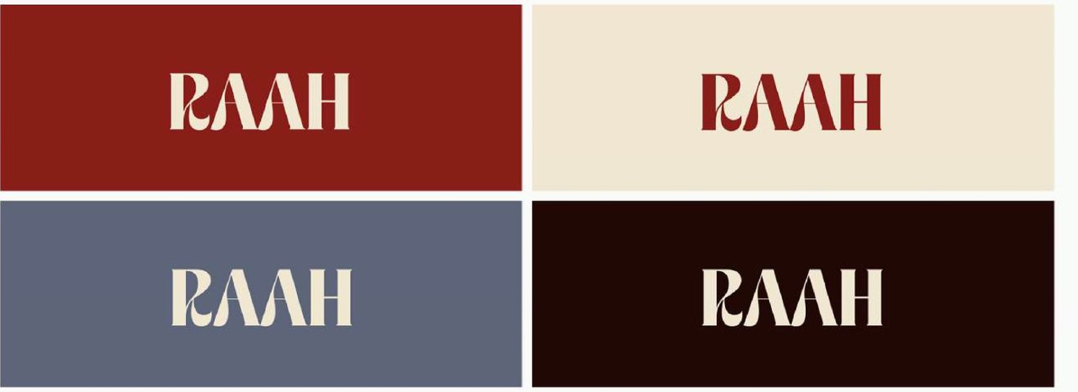
Maroon for confidence, cream for warmth, slate for business.
Four colours, each carrying one part of the brand: the energy of stepping up to speak, the welcome a first-time student needs, and the calm a business client expects.
A display serif with character, and a plain sans that stays out of its way.
The serif leads: editorial, warm and elegant, giving every headline personality. The sans supports it: clean, neutral and easy to read, so body text never competes with the display.
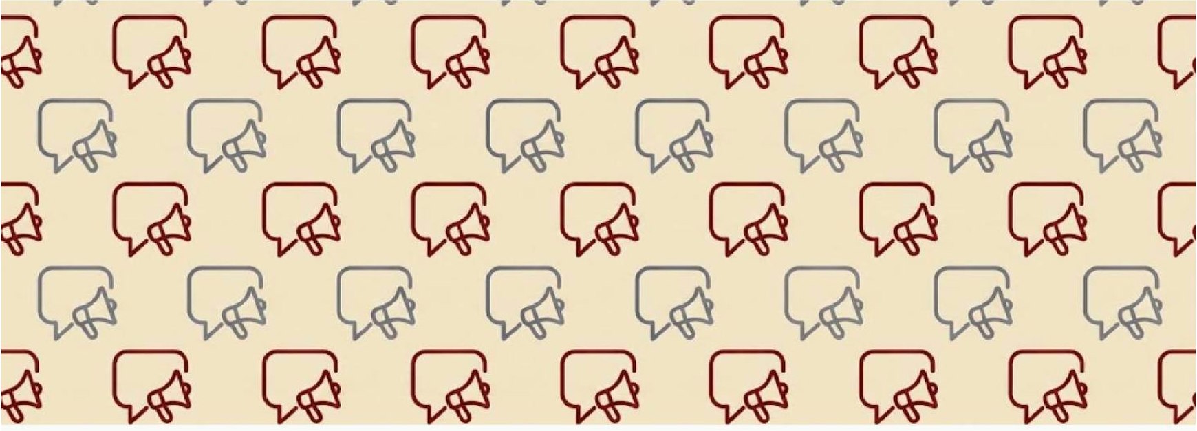
A pattern made of the two things RAAH does.
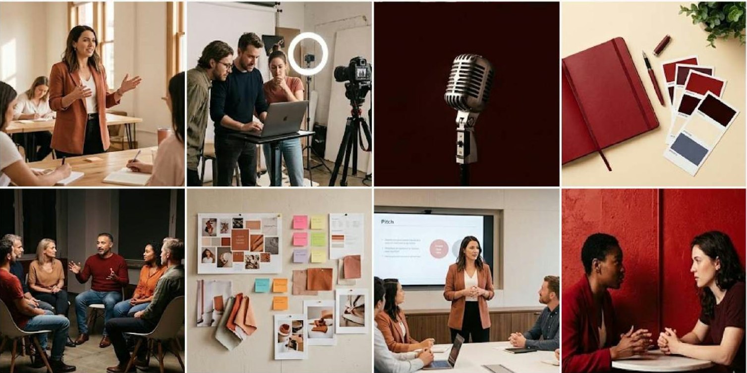
Speech bubbles for coaching people to speak, megaphones for marketing. Repeated together, they show both services at once, across packaging, stationery and merchandise.
On cards, stationery, merchandise and the website.
The stacked mark does most of the work at small sizes, and the maroon and near-black give each piece the same weight. The website carries the serif headlines and the warm, human photography onto the screen.
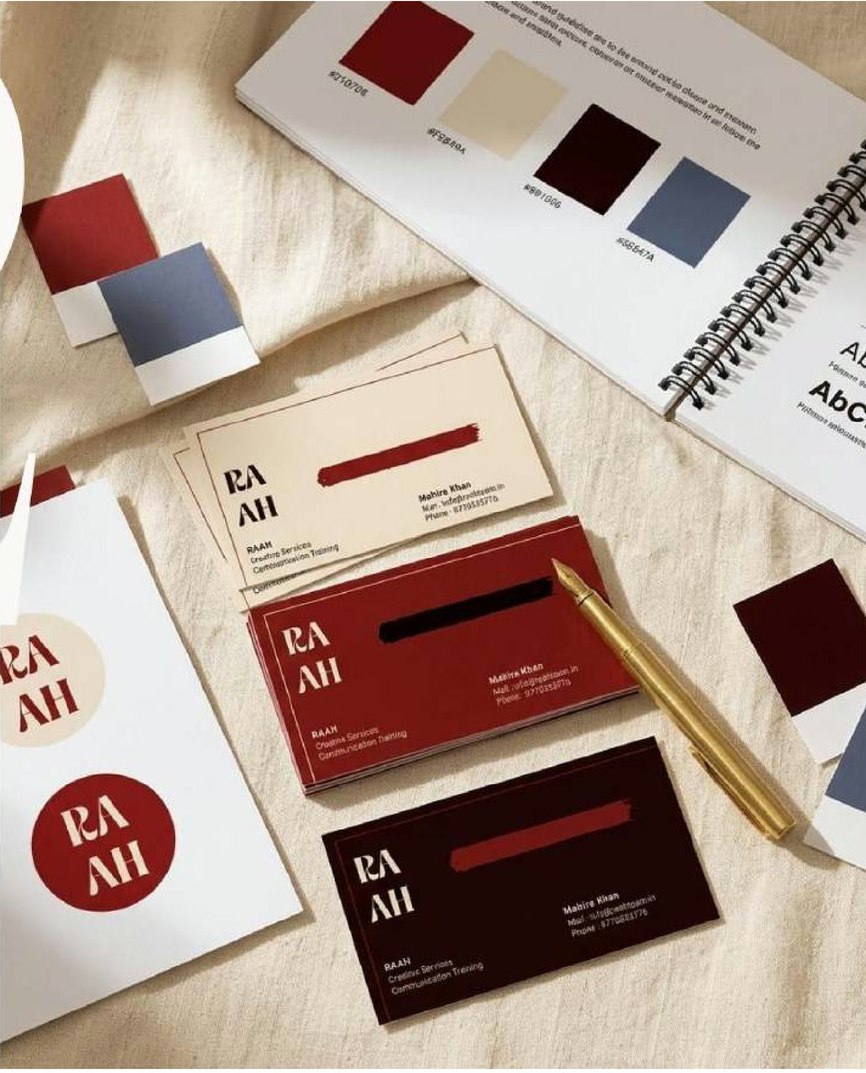
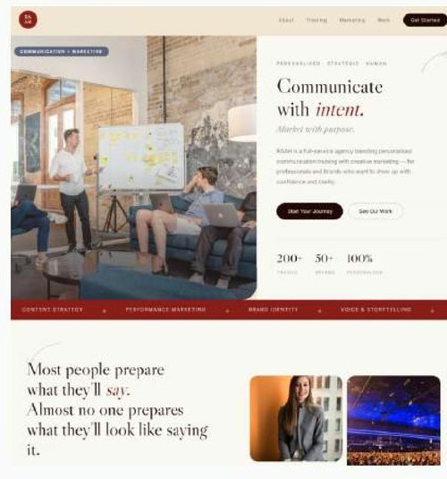
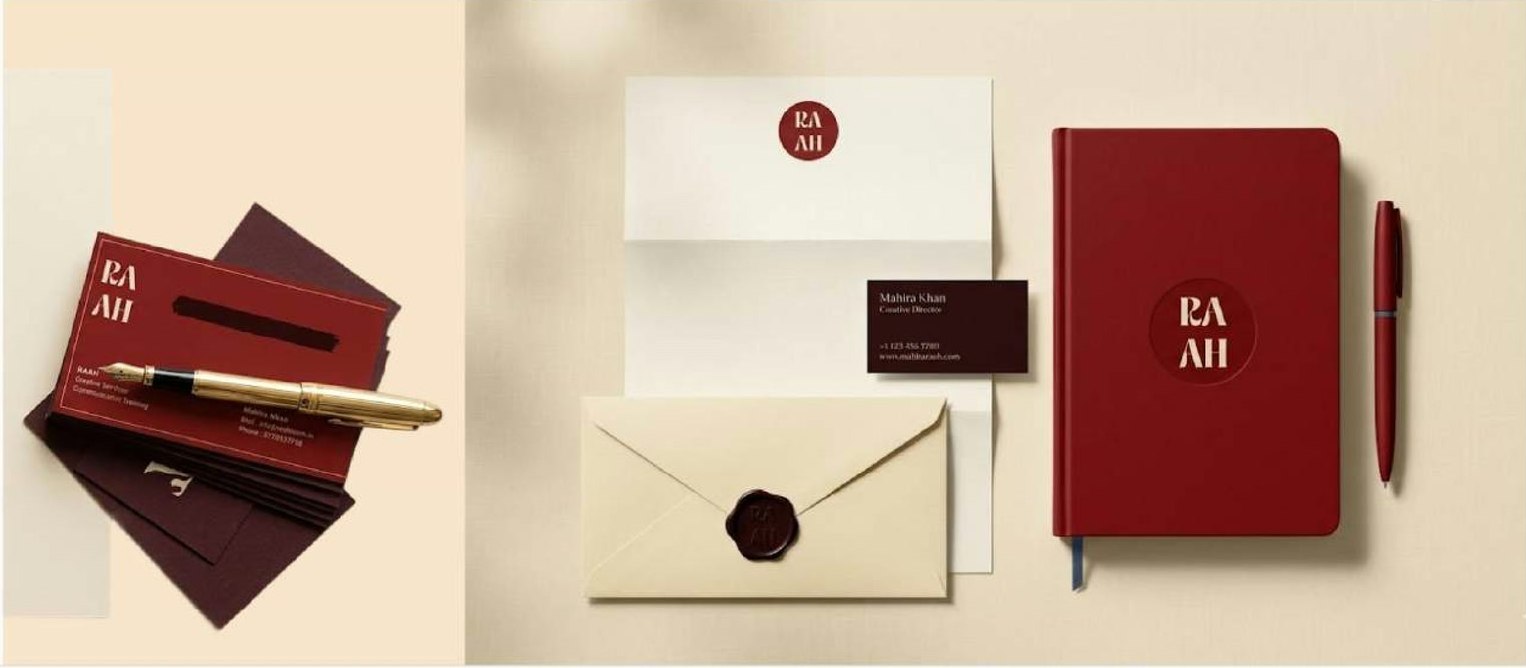
A logo in use, cards in hand, and a website to launch with.
Logo in use
RAAH uses the identity for the business.
Business cards printed
The cards went to print in the brand colours.
Website designed
Designed as part of the project; the details are under NDA.
What I learned
One mark can serve two audiences if each part has a job.
Designing for companies and for individuals at once, I stopped looking for a single feeling. The serif carries the credibility; the joined letters and the warm colours carry the people.
Informal clients need a formal process.
Working with someone I knew made it tempting to skip steps. Writing down the brief, the stages and a sign-off kept feedback focused and stopped the project from drifting.