
A new website for the Museum of Food and Drink, built around visitors
A museum about what food means, on a website that didn’t say it.
The Museum of Food and Drink in Brooklyn tells the stories behind what we eat: migration, identity, power and joy. It has reached more than 500,000 people through 25+ exhibitions. Its old website was messy, and neither that idea nor the practical details of a visit came through.
I worked in a three-person freelance team: a team lead, a senior designer, and me as the junior designer. I ran the research, the information architecture and the wireframes, and designed the homepage hero, the What is MOFAD section and the footer. A developer built the site in Framer.
Research & IA
An audit of the old site, a comparison of 8 museums, and the site map.
Wireframes
Moodboards and five homepage directions.
Visual design
The hero, the What is MOFAD section and the footer.
Three things the old website got wrong.
The mission didn’t come through.
“Food is culture” was the museum’s whole point, but nothing on the site made you feel it. It read like any other museum’s website.
Planning a visit was hard.
A first-time visitor had to dig for the basics: what’s on, when it’s open, how to get tickets.
It was messy and outdated.
Too much content with no clear order, and a look that no longer matched the museum.
Eight museums, scored against ten criteria.
I ran the comparison. Eight food and culture museums, each scored on navigation, visual design, interactivity, content, accessibility, calls to action, emotional engagement, user journey, new features and languages.
Most food museums look clean and say very little.
Almost all of them scored well on navigation and visuals, and poorly on interactivity, content and accessibility. They were tidy, but they didn’t make you feel anything, and that was the one thing MOFAD’s site couldn’t get wrong.
The British Museum was the benchmark.
It scored well almost everywhere, and the reason was restraint: an “on this page” list on every page, the main text on the left with key points pulled out on the right, and card colours that change with the content.
- Designing for emotion on purpose
- One clear call to action per section
- Content split into something to read and something to scan
- Competing calls to action
- Moving images and overloaded dropdowns
- The museum’s story hidden on the About page
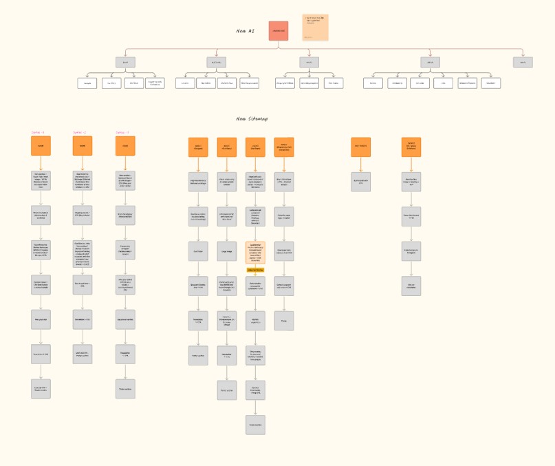
A site map built around two kinds of visitor.
People come to the site wanting one of two things. A first-time visitor is deciding whether to come. A supporter already believes in the museum and wants a way to help. So Visit holds the practical questions, Resources holds the exhibitions and programmes that show what MOFAD stands for, and Donate is always one click away without being pushed at the top of every page.
The site map as designed. The live navigation has since been regrouped under What’s Happening and Get Involved.
Five homepage directions, before any styling.
After moodboards, I wireframed five versions of the homepage. They share the same order (hero, what MOFAD is, the current exhibition, why food matters, plan your visit, get involved) but move the weight around: how early the exhibition appears, whether the mission is three short columns or one passage, and how strongly the page pushes a visit.
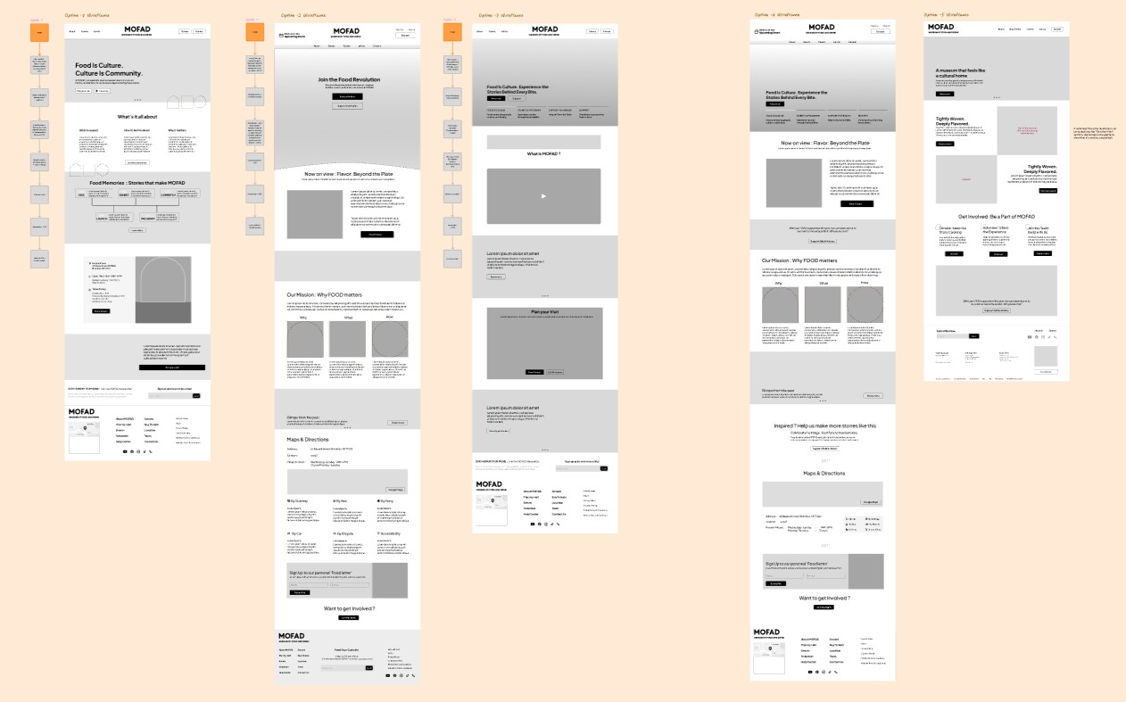
Having five real layouts to compare kept the discussion on trade-offs, not taste. The final homepage took parts from several of them.
Keeping the brand, and making it work on a screen.
The brand already existed: the wordmark, the coral and the “Food is culture™” line. The job was to carry it into a website, not to redesign it. The team built a shared set of buttons, cards and spacing, and I designed three parts of the homepage.
The hero: the idea first, then the next step.
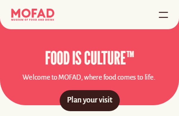
FOOD IS CULTURE™ in large condensed type on coral, one line of welcome, and one button: Plan your visit.
The question the old site made hardest to answer is now the first thing you can click, on a laptop or a phone.
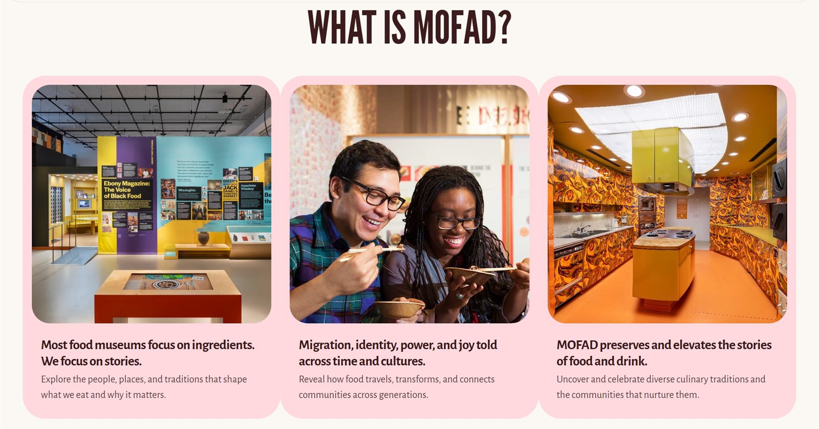
What is MOFAD: three short statements, not a wall of text.
Each card pairs a bold statement with one supporting line and a photograph from the museum. A first-time visitor can scan all three in seconds, which is the read-and-scan split the research pointed to.
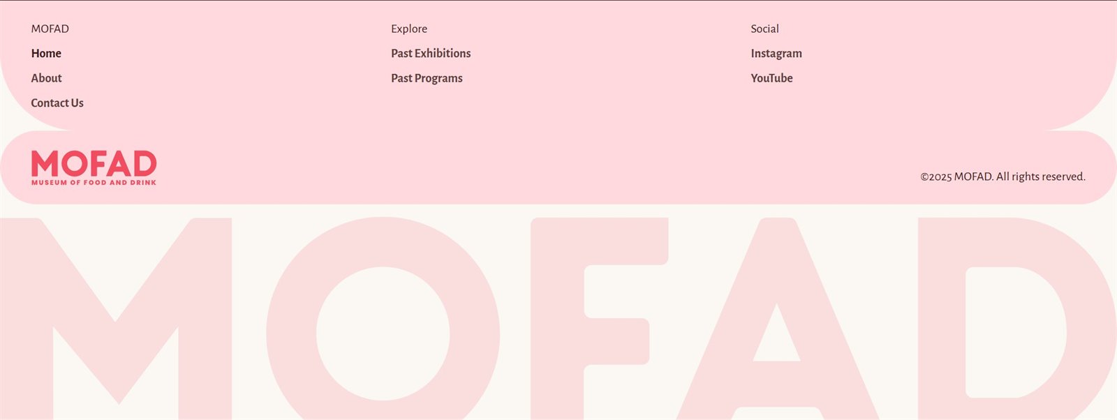
The footer: the whole site at a glance.
Three plain columns (MOFAD, Explore and Social) and an oversized wordmark that closes every page.
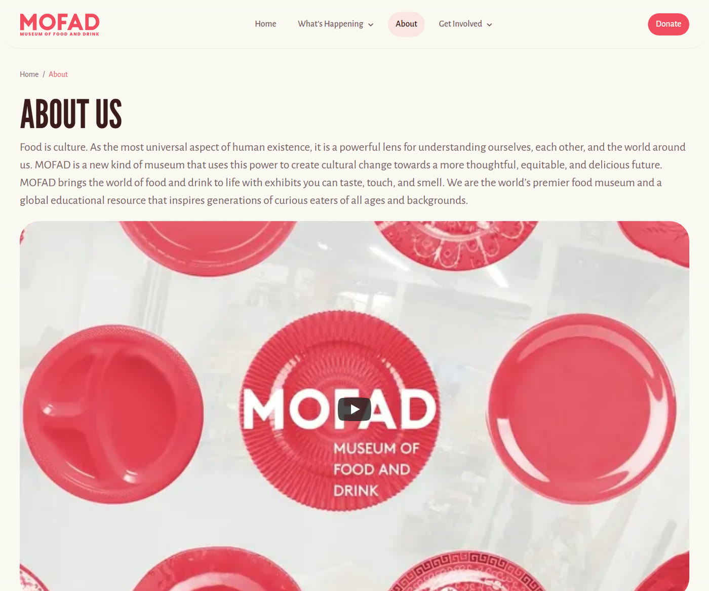
Live at mofad.org, and the client was happy.
Live
Built in Framer by a developer and running at mofad.org, with some changes MOFAD has made since.
A visit comes first
Plan your visit is now the first button on the homepage.
Client approved
MOFAD was happy with the redesign.
What I learned
As the junior, my job was to widen the options and back them with evidence.
With a team lead and a senior designer making the final calls, polish wasn’t what got my ideas into the site. Clear reasoning was: five concrete layouts, and research the team could point to.
The structure outlasts the details.
Once a developer builds a site and the client runs it, the details drift. MOFAD has already added panels and regrouped the navigation. What held was the hierarchy and the system, so that’s where I’d put the most care again.